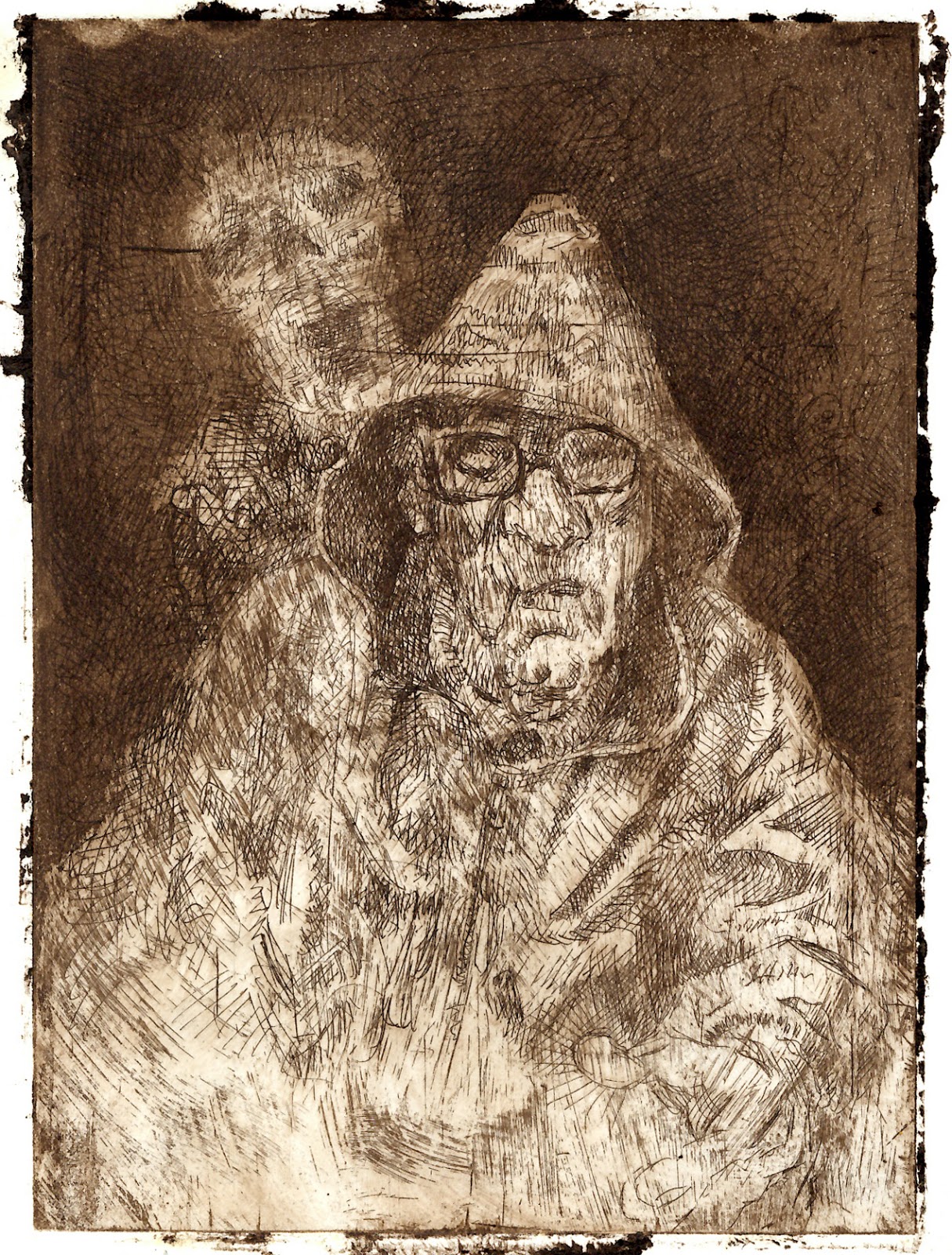
I am having a great time in the print workshop doing etchings! There are so many possibilities that I have decided to be methodical. I am concentrating on one aspect per plate. The first, Death on the Bus (pictured a couple of posts below) I limited strictly to a relatively formal cross-hatching. Working up layers for dark areas, instead (as I mentioned in a previous post) of using finer hatching.
Advantages include: A good range of subtle variation especially in swatches of dark area. Darks that lack the velvetiness of aquatint but whose small perforations lend an interest only line can.
Disadvantages: A rather staid, Victorian feel. One misses curved line & instinctive—expressive—flourish.
Death & the Multitude also took me two plates & four proofs to finish, the same as the old man on the bus. I used this one as an experiment with combining different depths of bite. I like the result. One can layer hard expressive strokes over cottony, shallowly bitten layers. Since it was unrelated to examining the potential of varied darkness of line, I also let my hand loose to add noise (such as the squiggly lines around the border) & a kind of uncontrolled doodle mark I have used extensively over the surface generally. I also added tiny circles here & there; I won't know if they are discernible until tomorrow's acid bath. But, as I often find myself doing when painting I think that small, almost subliminal surface patterning, will add liveliness & interest to the drawing.
In fact, typical of having done the drawing without reference, it has come out a little cartoonish, a little rubbery, which makes the surrounding effects the stronger part of the print's general impact.
Here, the four states:
Plate II proof I

Plate II proof II

Plate II proof III

Plate II proof IV—final

And with final drypoint retouches (with less plate tone because
I took the trouble to scrim with care)

I have done at least one thing to bring the vase forward, every day (excluding week-ends) since the end of January. The vase's direction is still vague. So, I am taking a step at a time & waiting for an inner vision to coalesce. For the moment, I have been adding texture, mostly.
Summarily:
- I blocked the figures in with palette knife & thick acrylic layers over dried layers (over the graded blue background)
- After having struggled with many craquelure recipes & preparations in my life, with mixed success, I found the pseudo-plaster, plastic concoction that I ordered Online, excellent. One coat—the thicker you apply it, the bigger the cracks. I did the shoulder of the vase to the opening under the lid, in: thin-thick-thin layers, as I worked from top outward. I then applied a kind of Tuscan-wall-orange, somewhat opposite to the Ultramarine & Cobalt blue backdrop. If I had found the material sooner, I would have covered the whole vase as a first step.
- I made moulds for sperm & breasts in many sizes, which I poured in latex. (I may use sperm for his fingers). I attached the first two breasts (of 20 or so) on Friday, using a good quality epoxy (overkill, perhaps, but I don't want any problems with bits falling off later). Once I have epoxied all the extraneous parts that I am going to, I will begin working over them with acrylic paints to bring them to the same stage of finish as the bodies. I will also need to rework the heads that were partly covered by the crackle layer. But I have decided it is a good thing. I would like the heads to stand out in higher relief than their bodies.
- Another day, I took my Daler-Rowney FW acrylics (which disappointed me with its lack of bonding strength when I used them to paint on copper) &, using the eyedroppers incorporated in the lids, I dripped the paint at the point where the craquelure ends & let it drip to different heights while using a stick to make a web-like pattern out of the drips as they fell. Cadmium red on Ultramarine blue! The vase's overall coloration is tending to garish but these are early layers yet. I trust I will find the right solution as I muddle through. So far, I think it has only become more interesting with each addition, fingers crossed my luck holds till the end.


'Sculpture Painting':
Leading from my last discussion with Keith, I took his suggestion for interacting figures, instead of single ones, as my starting point. I looked at a lot of things, especially figure groups by Rubens, & Greek vases & the like. And finally, hit on a memory of Bronzino's sexy Venus & Cupid. The dynamic contraposto combined with the spiral way the figures slot together—with some small changes—would be interesting from all four sides.
I did a few sketches including some where I sketched the body separations in cubes, & I made the changes to the composition (including the removing of Bronzino's loving attention to the cherry-like qualities of Cupid's burnished bum :) & drew it from every side, before making paper cubes, two & a half inches to a side, to try the thing out in three dimensions. It was then that I realised that, for the piece to be successful, it needed more than an interesting painting on a pile of cubes & that, in fact, I shouldn't be using closely grouped figures at all. Aside from the painting, what needs to also be interesting is the pile of boxes itself.
I then started sketching figures divided by empty areas that would be spaces between the cubes. I also looked for differences in width & depth so that, when looked on from any side, the boxes will stick out more or less not only in silhouette, but also toward & away from the viewer. I don't know where the idea came from, but I considered two adults pulling a child by opposing arms. I also tried out an exaggerated one-point perspective in the directions the adults pulled (obliquely toward the top). I am now more hopeful, however, for another idea I have sketched, two men; one menacing, the other defensive.
I am now waiting to hear from Richard, whom Rebecca contacted for me, to arrange some sittings where I will try the idea out with sketches from life.


Changed the position of both of her arms


Changed his position

Considering non-cubic boxes

A plan for making a form in which to pour plaster cubes to try out different approaches (I realised that it would be easier to cut cubes from wood—easier to make as well as easier to make different sized boxes, as I realised it needs)

Paper cube construction


Granite cylinder (sideline):
I will do my utmost to spend little time on this—that I won't let it distract me from the end of year objectives.
I found a cylinder of Granite on a construction site, 10 centimetres in diameter & an uneven 20 or so of height. I have built a clay base for it so that it stands upright, & I have attached it with epoxy. I have done a couple of sketches of ideas for the terracotta figure I want rising from the top.


Kinetic figure painting:
I have a canvas that matches the one I used for the painting of Vaish. I have decided to continue the exploration with a companion piece with male model. I have done no sketches & I don't know in which direction my experimenting will go. I want it to grow from the simple beginning I plan, of its own accord: feeding on its own inspiration spontaneously. The idea I have to start with is a figure based on Ingres' Oedipus & the Sphinx.
I am waiting to arrange with Richard for this too.
Chapbook:
Outside of school work I have also continued making regular additions to the, now six month old, project.
Darwin's Fish:
On hold until I can find a little time.